
5 benefits of visual communication
The benefits of visual communication
- Enhance brand identity
- Transcend communication barriers
- Increase retention
- Boost engagement
- Simplify complex information
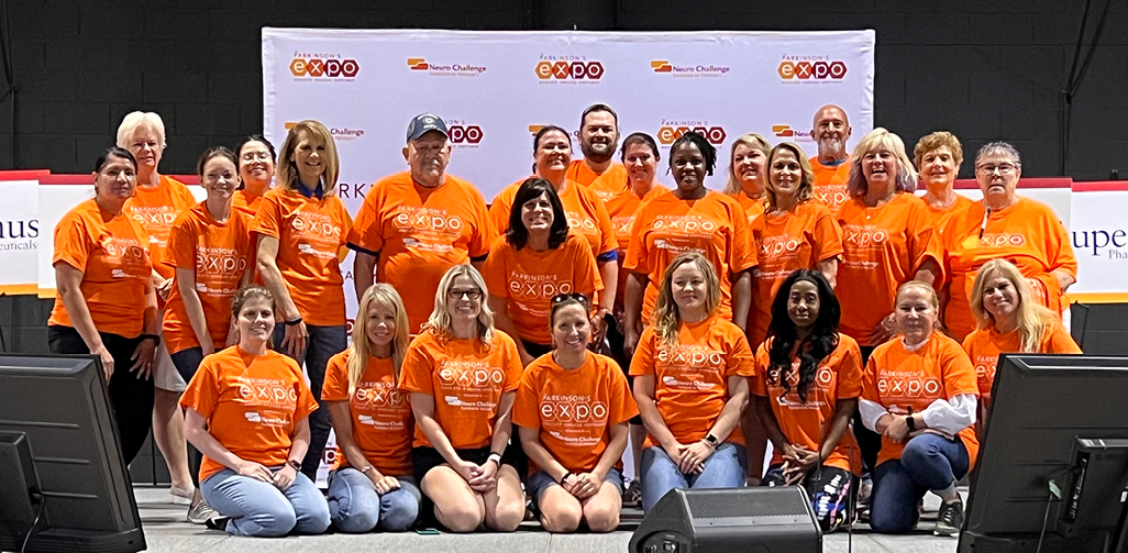
A sea of vibrant orange shirts and swag bags greets attendees as they step inside the Parkinson’s Expo, hosted by Neuro Challenge Foundation for Parkinson’s®.
“Orange is the color of Parkinson’s disease awareness. When you look across the room, it’s a magical feeling to see all the orange,” said Donita Pace, office manager. “Not only does it make our team members easy to spot, it also really helps people feel supported.”
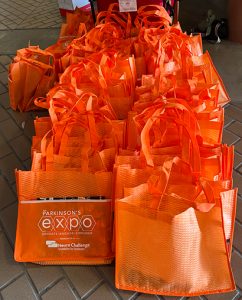
The Parkinson’s Expo attracts approximately 1,600 participants and brims with electric energy. Volunteers don orange T-shirts. Each attendee receives an orange swag bag. The bags welcome and connect attendees, symbolizing their shared experiences with Parkinson’s. The wave of orange taps into one of five dynamic benefits of visual communication—enhancing brand identity.
Draw attention to your organization using vibrant brand colors.
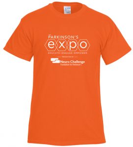
Gildan® Ultra Cotton T-Shirt
1. Enhance brand identity
A visual is more than an image. It is an effective way to reinforce your brand identity. Visual elements, such as logos, color schemes and imagery, make a brand instantly recognizable. Consistently displaying branded visual elements helps build trust and loyalty. Every visual encounter helps support a brand’s message, strengthening its impact.
For Neuro Challenge Foundation for Parkinson’s, the color orange is a symbol of unity, guidance and inspiration. The impact goes beyond the Parkinson’s Expo. The foundation’s Paint the Town Orange initiative takes the vibrant hue to the streets of Sarasota, Florida.
Armed with the orange swag bags filled with useful items, staff and volunteers venture to doctors’ offices, local businesses, downtown shops and more. As they distribute the colorful swag bags, the volunteers leave a trail of awareness and support in their wake.
The bright orange bags act as beacons, guiding people looking for Parkinson’s resources to Neuro Challenge Foundation. The bags also support people impacted by Parkinson’s.
Support your brand’s message using consistent visual elements.
2. Transcend communication barriers
Visuals transcend language, convey meaning and foster connections. Serving as a universal language, visuals are a powerful tool for breaking down barriers and uniting people from diverse backgrounds.
Visuals also support people with different learning styles. For example, if team members take in information differently, they may have difficulty absorbing information and communicating with one another. Visuals can bridge the gap and make working together much easier. O.H. Partners, an agency of The Harkey Group, uses visuals to elevate communication.
In the bustling world of projects and deadlines, where clear internal communication is key, O.H. Partners uses a quirky secret weapon: MopTopper stress relievers. Color provides a visual cue that helps O.H. Partners better communicate.
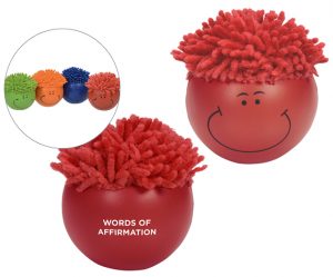
MopTopper Stress Reliever
O.H. Partners kicked off an initiative to understand what made each employee feel appreciated. After taking a test from “The 5 Languages of Appreciation in the Workplace,” by Gary Chapman, each employee learned how they best receive acknowledgment. Some felt appreciated when they received a gift—others, when they performed an act of service. Each “language” is represented by a color.
Once everyone learned their language, Jennifer Bohnsack, vice president of people and culture, gave each employee a MopTopper stress reliever in their color. Team members placed their stress reliever on their desks, where they provide a visual cue to colleagues.
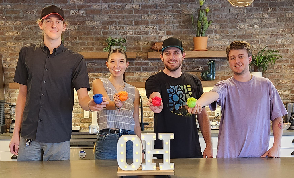
“My language of appreciation is words of affirmation, which is the color red,” Bohnsack said. “It’s easy to do an exercise like language of appreciation and then put it aside. However, when someone sees their teammate’s brightly colored stress reliever in front of them every day, it’s a good reminder of how that person best communicates and how to best value them. I work closely with three colleagues, and I’ve noticed they’ve all tried very hard to make sure they’re communicating to me through words, written and verbal, on how much they appreciate me and value my contributions.”
3. Increase retention
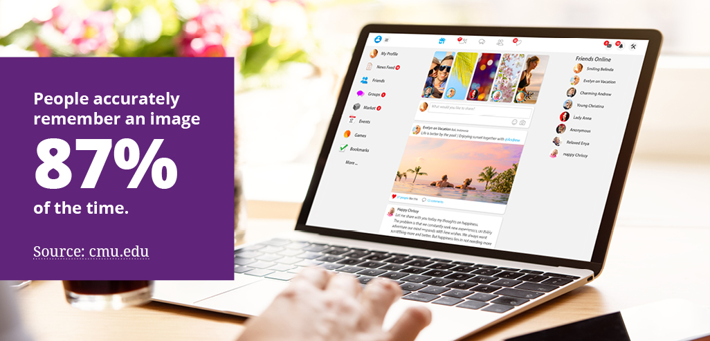
Information retention improves significantly when using visuals (PDF). One study discovered people accurately remember an image 87% of the time (PDF).
Another benefit of visual communication: It cuts through the noise and compels people to take notice. Eye-catching images and interesting infographics provide visual breaks in a sea of text, capturing attention and leaving a lasting impression. Visuals can also tap into emotions, forging strong connections and keeping your message top of mind.
4. Boost engagement
If content is king, engagement is the crown. Compelling visuals engage viewers and inspire them to share content. People are three times as likely to engage with X (formerly Twitter®) content that contains a visual. On average, LinkedIn® posts that include imagery have a 98% higher comment rate (PDF).
Visuals evoke emotions, ignite conversations and create a ripple effect across social media platforms and via word of mouth. In fact, O.H. Partners found that the right visuals can also boost onboarding engagement for new hires.
At the request of the organization’s leaders, the human resources team now gives new hires the “language of appreciation” test. During onboarding, new employees are excited to discover their results. They look forward to receiving MopTopper stress relievers to proudly display on their desks. It’s one way to ensure every team member feels valued.
5. Simplify complex information
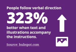
Visuals help people easily grasp complex information by simplifying concepts into a digestible form. For example, people follow verbal directions 323% better when text and illustrations accompany the instructions.
Visuals also breathe life into verbal presentations, improving understanding and impact. Supporting spoken words with relevant visuals reinforces key points and engages audiences, leaving a memorable impression.
Unlock the power of visual communication
As O.H. Partners and Neuro Challenge Foundation for Parkinson’s demonstrate, harnessing the powerful benefits of visual communication helps brands cut through noise, enhance brand identity, increase retention and boost engagement. These attributes make visual communications a powerful tool for any organization.
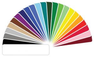
Shop for your brand giveaways using 4imprint’s color filters. 23 colors available!
Looking for more information about this topic? Email [email protected] with inquiries.
Trademarks:
Neuro Challenge Foundation for Parkinson’s is a registered trademark of Neuro Challenge Foundation, Inc. non-profit corporation FLORIDA 722 Apex Road, Unit A Sarasota FLORIDA 34240
Twitter is a registered trademark of Twitter, Inc. CORPORATION DELAWARE 1355 Market Street, Suite 900 San Francisco CALIFORNIA 94103
LinkedIn is a registered trademark of LinkedIn Corporation CORPORATION DELAWARE 1000 W. Maude Avenue Sunnyvale CALIFORNIA 94085
Gildan is a registered trademark of Gildan Activewear SRL sociedad de responsabilidad limitada (srl) BARBADOS Newton Christ Church BARBADOS BB17047