Tips and tricks for visual marketing success
Humans are visual creatures. Our brains process visuals 60,000 times faster than text. Most information (90 percent) transferred to our brain is visual, and most sensory receptors (70 percent) are in our eyes. We use half of our brains as we process visuals.[1] Some people say they’re visual thinkers; we’re actually all visual thinkers!
Visuals—photos, ads, memes, infographics—can tell the story of your business faster. Too often, though, small businesses don’t have a team or a budget to create these marketing graphics to tell their story.
In recent years, many free and low-cost graphic design tools have emerged to help businesses create on-brand web graphics, social media images and more to leverage our visual nature. It’s a good thing, because the business case for graphic design is strong:[2],[3],[4],[5]
We engage with visuals. Take the case of Facebook®: Companies enjoy 180 percent stronger engagement for Facebook updates in the form of photo albums and videos. Facebook posts with photos drive 53 percent more likes than the average post. Because people like to share and respond to graphic content, visuals are easy to go viral. Consider that highly sharable infographics help companies grow 12 percent more than companies that don’t use infographics.
Visuals drive conversions. Behold the power of Pinterest®. Referred traffic from photo and video posts on Pinterest is greater than referred traffic from Twitter®, StumbleUpon®, LinkedIn® and Google+® combined. Twenty-one percent of people with Pinterest accounts have purchased something they’ve seen on Pinterest. Image-rich Pinterest and Instagram® drive visual marketing. These networks show the visual representation of your brand, and it’s often the only interaction an audience has with your business.
In this Blue Paper®, you will learn graphic design fundamentals, discover a collection of free and low-cost graphic design tools, explore the impact of these tools on graphic design and understand when you should hire a professional designer. Accessing your artistic side never has been easier!
The rise of graphic design tools
Visuals draw in human eyeballs, and the demand from businesses to leverage this law of biology has given rise to a plethora of graphic design tools. But, there are even more reasons why the number of free and low-cost graphic design tools has exploded. Check them out:[6],[7]
Tools fill a gap. Fifty-three percent of marketing professionals worldwide said the lack of internal content-creation resources was their biggest challenge to content marketing success. One quarter of marketing pros said the lack of employee graphic skills was a challenge. Forty percent of marketers cited budget constraints as a challenge to content marketing. Design and photography resources, if they exist, often are tied up in bigger projects. Scaling production of visual assets is an obstacle.
Tools help make a splash on Pinterest and Instagram. Times have changed. Images are less about profiling product features and more about connecting with audience lifestyle and values on social networks.
Tools allow for DIY images to keep pace. Social sharing happens in real time; you need images right away. User-friendly and low-cost graphic design tools help you get down to business fast.
Graphic design tools for visual marketing
Let’s get to the good stuff—all the goodies you can stuff in your graphic design toolbox. A Google® search for graphic design tools turns up tons of options. We’ve curated a power-packed collection of free and low-cost design tools to give your visual marketing more pop:
Color: Pick the perfect hue
- Adobe® Color CC: Upload a photo or explore different color relationships (complementary, monochromatic, etc.). This tool can help you find on-brand accent colors.
- COLOURLovers: Browse colors and patterns. Users create trend-setting color palettes to inspire.
Text: Leverage your letters
- WhatFont: Identify the fonts on a webpage. If you visit a site and love the look, this tool can help you name the type—and you can then try it for yourself.
- DaFont, 1001 Free Fonts, Font Squirrel: Find something special in these font libraries. The personality of your brand can really shine with the right font.
Infographics and charts: Let data drive
- Easel.ly: Choose from thousands of templates, or kick things off with a blank slate. Mix and match icons for total customization; no two projects will look the same.
- Infogr.am®: Publish visualizations of your data. Embed charts and graphs on your website and display data in real time to tell your story with numbers.
Photos: One image, 1,000 words
- Creative Commons®: Search for images to borrow, alter and attribute. To avoid legal issues around copyright and usage, review and follow the licensing agreement carefully—a good practice for any image you’d like to use!
- Death to the Stock Photo®: Get emailed high-quality stock images monthly. You can use these photos, shot by professionals, any way you please (with a few exceptions), and you don’t need to attribute the photo.
Photo editing: Add polish
- PicMonkey®: Recolor images, add text and more with this photo editor. The tool is designed for design novices. For example, image resize options are explained as “best choice for slow computers,” “best choice for most printing and online needs,” and “best choice for archival purposes or the Sistine Chapel.” (Oh yeah, it’s funny, too.)
- VSCO® and Snapseed®: Edit photos on the go. These mobile apps deliver big functionality on your phone, so you can snap a pic, edit and share without sitting at a desktop computer.
Test drive this collection to develop on-brand visual content. And, know there are even more to choose from!
A closer look at two graphic design tools
You have many options when it comes to graphic design tools. But, in many cases, their functionality and usage is fairly comparable. Let’s look at how to use two similar online content-creation tools: Visme® and Canva®.
Visme helps marketers create infographics, presentations, web content and animations. It has three account options: free, standard ($7 per month) and complete ($16 per month).[8] It’s primarily for digital visual content.
Canva helps marketers create pre-sized social media images, ebooks, print materials and more. It’s free, but there are some photos in Canva’s library that sell for $1 each. Canva also offers version sharing with collaborators.[9] Canva has a few more bells and whistles than Visme.
You basically follow the same creative process with either Visme or Canva:[10]
- Pick a template. What are you making? A social post? An ad? Pick a pre-sized document (or create your own custom size).
- Make it pretty. In the work space you can search for images, drop in a ready-to-use layout, choose text elements, upload images and more.
- Finalize your creation. Send it out into the world.
With all graphic design tools, experiment to discover which ones work best for you and your project. Each tool has pros and cons, and with so many options to choose from, you’re sure to discover a new favorite—or two!
Designing graphics success: Tips for the novice
Before you start playing with these graphic design tools to build infographics or create memes, you need to understand the fundamentals of graphic design. The following principles will steer you clear of many novice design disasters:[11],[12],[13],[14],[15]
Respect the process
To start, define the purpose of your content. Evaluate the need, identify requirements and set success metrics. Next, do your homework. Collect facts and even objects for a more thought-out result. For instance, create a mood board of images and color swatches to discover a project theme.
Design with the medium in mind. For example, design for a book must take the gutter (the space between the pages) into consideration. Design for the web should be in RGB color mode. Quirks of each medium will influence design decisions. Consider sketching out a design before diving into design software. Sketching is brainstorming. Develop copy and visuals together. Planning ahead delivers a more powerful product.
When you’re feeling stuck, take a break. Come back and look at your design with fresh(er) eyes. And, get comfortable with imitation and iteration. Find inspiration on social media, websites and news publishers, and apply similar—but not the same—treatment to your own content.
Build a hierarchy
Ranking content visually shows the relative importance of each element (Figure 1). Make the most important part of a message the most visually dominant element. Look at the content for your visual creation from a macro level—all the elements that build toward your purpose—and rank them. Don’t be scared of scale: Make your design dynamic by changing the scale of objects and elements, this will give your graphic features visual order.
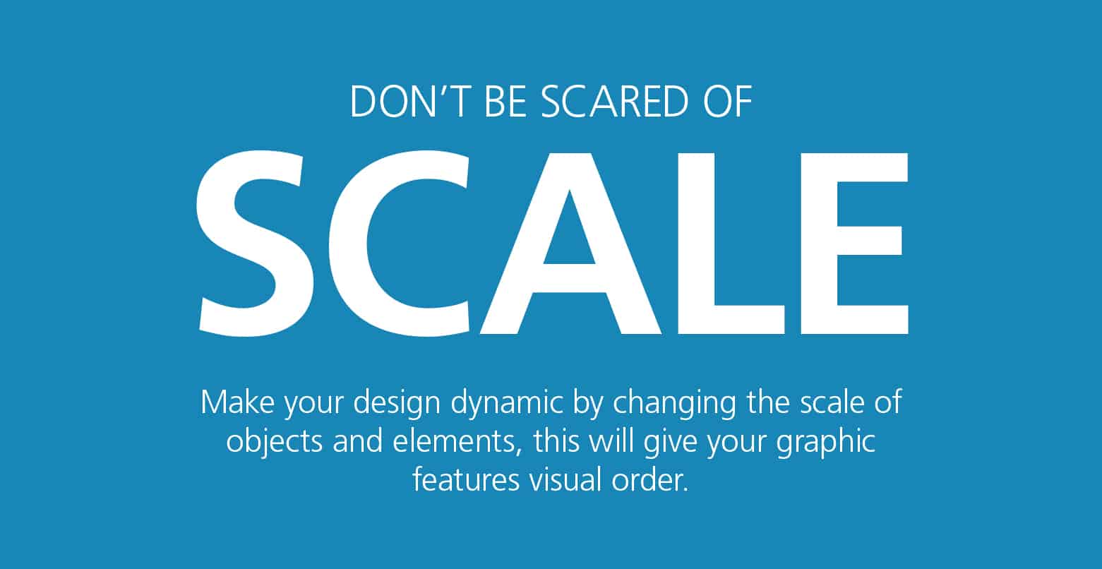 Figure 1: Scale shows importance[16]
Embrace white space
White space without elements draws attention to elements. It also improves readability. If something’s not right with your design, add more macro white space. And, when you first start designing, white space will make you uncomfortable. (Yup, that’s totally normal!)
Fall in line
Use a grid to ensure vertical and horizontal alignment. Breaking from a grid creates unnecessary tension and focal points. If you have horizontal and vertical images, a grid can improve the look of the collection (Figure 2). No naked images – use grids and frames to give your design a professional edge.
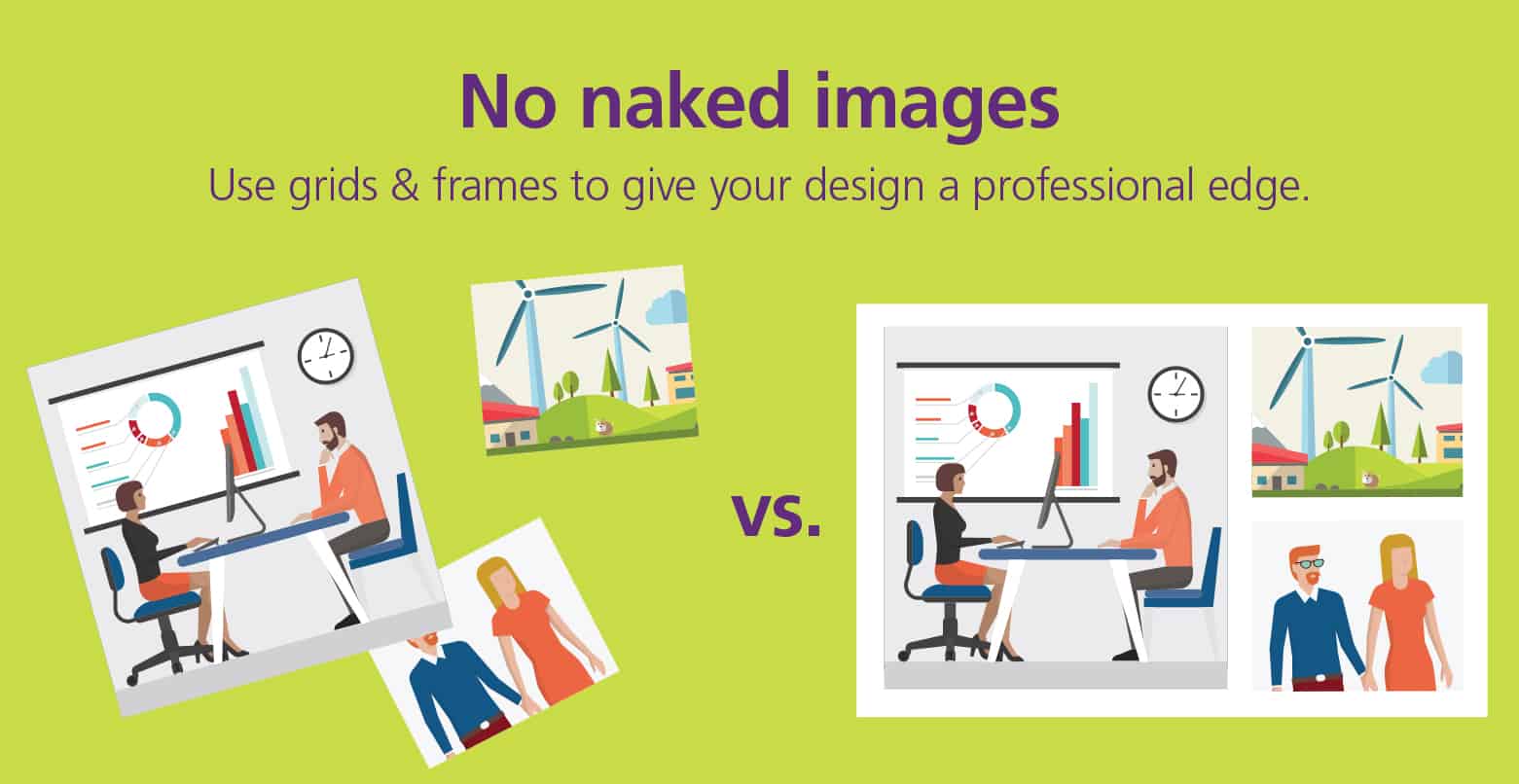 Figure 2: Align images[17]
And, dump center alignment in favor of left. Left alignment adds white space (whose importance has been discussed).
Reign in the rainbow
Limit colors. Start with two colors, and give each color a job. For example, one color is for calls to action; one color is for body text. (More advanced designers may use one to three primary colors and one to three secondary colors.) When picking colors, think about what you’re trying to express. If you’re aiming for relatable “human” colors, choose a warm color: red, yellow or orange. If you want to express professionalism and calm, choose a cool color: blue, purple or green.
Keep type simple
Limit fonts. Use three fonts maximum. Your eyes struggle to scan too many different fonts. Better yet, pick one font family with several variants: bold, italics, condensed, etc.
Don’t squish letters together so they’re hard to read or space them out so they seem detached from each other. The ideal character count per line of text is 50 to 60. The text will be easier to scan in narrower columns. 50-60 characters per line: The ability to choose just the right typeface for your design project can make a world of difference. Although typography can be a complex subject to delve into, learning a bit about the history of typefaces will help you understand what makes each classification distinct from the rest.
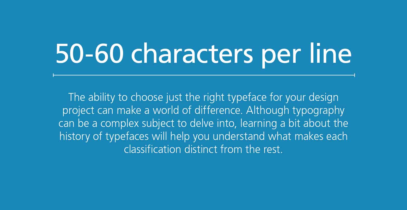 Figure 3: Limit characters per line[18]
Adjust the brightness of the background to increase the contrast between it and the text. The text will become more clean, crisp and clear. Use a dark background with light text (and vice versa). Match the mood of the fonts. Font choice communicates a message all on its own. For example, fonts with rounded edges are friendly. Fonts with sharp edges are strong.
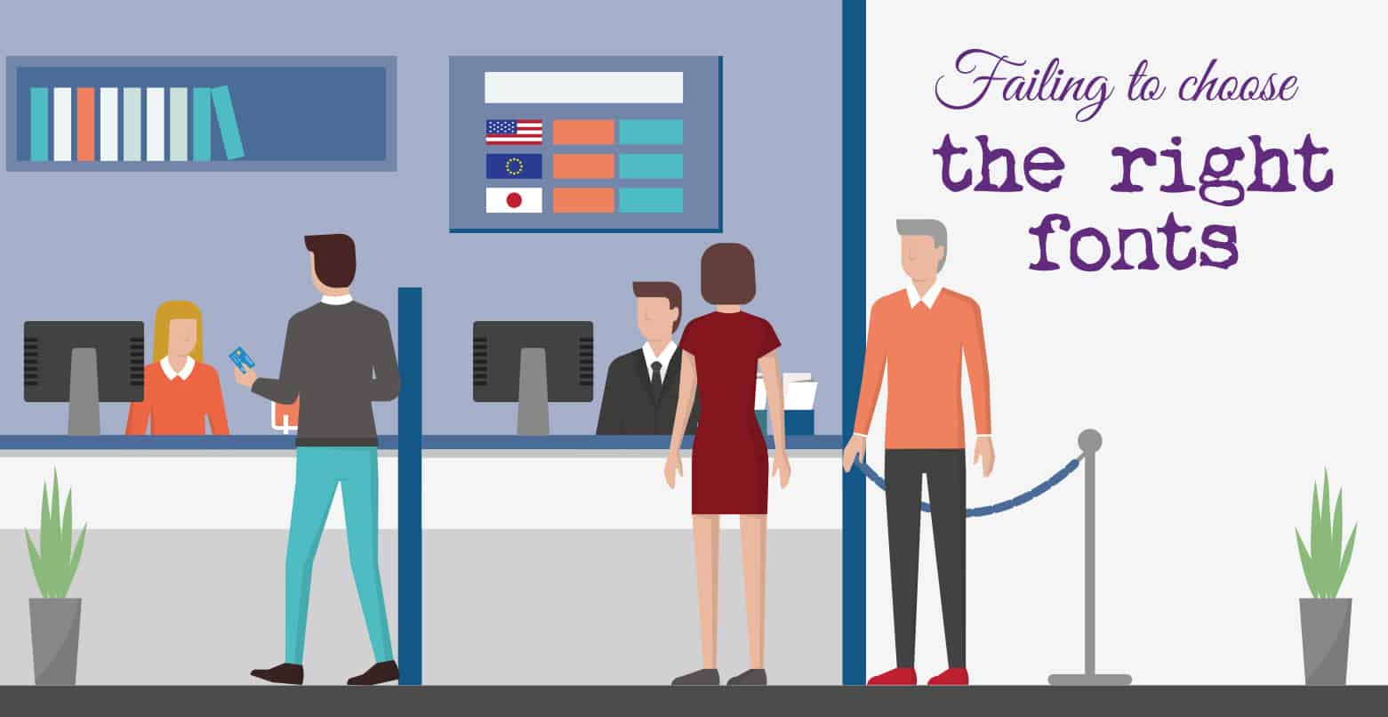 Figure 4: These fonts clash with the image[19]
Be predictable
Be consistent across pages. If your document has multiple pages, the best way to maintain visual consistency is to copy pages and edit text and images. When two design elements have the same function, make them look the same—size, color, font, etc.
Simplify and balance
Be subtle. A slight shadow, gradient or texture can put just enough emphasis on a design element. (But, don’t do all of them!) Think about hierarchy before getting fancy. Having too many words creates visual noise and can bog down the message in an infographic or presentation. Eliminate unnecessary text. For example, a graphic with only the words “Our guiding goal is delighting customers” versus a graphic with the words “Our guiding goal in business is in delighting our customers daily” followed by a bullet list.
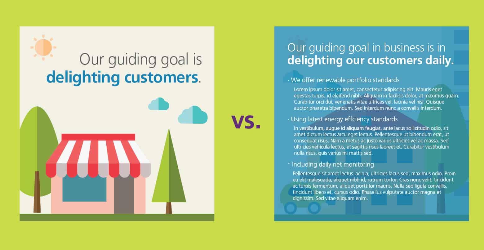 Figure 5: Use fewer words to pack a punch[20]
For the words you do use, balance space between lines of text (aka leading). Too little space and the text looks crowded. Too much space and the text looks disjointed.
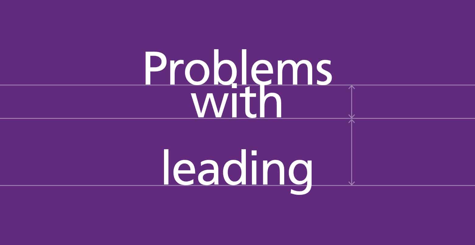 Figure 6: Balance lines of text[21]
Most of all, don’t try to do too much. Figure 7 compares two Facebook page cover images. The first image is restrained, and the text really pops. The other image is filled with competing calls to action that confuse the viewer.
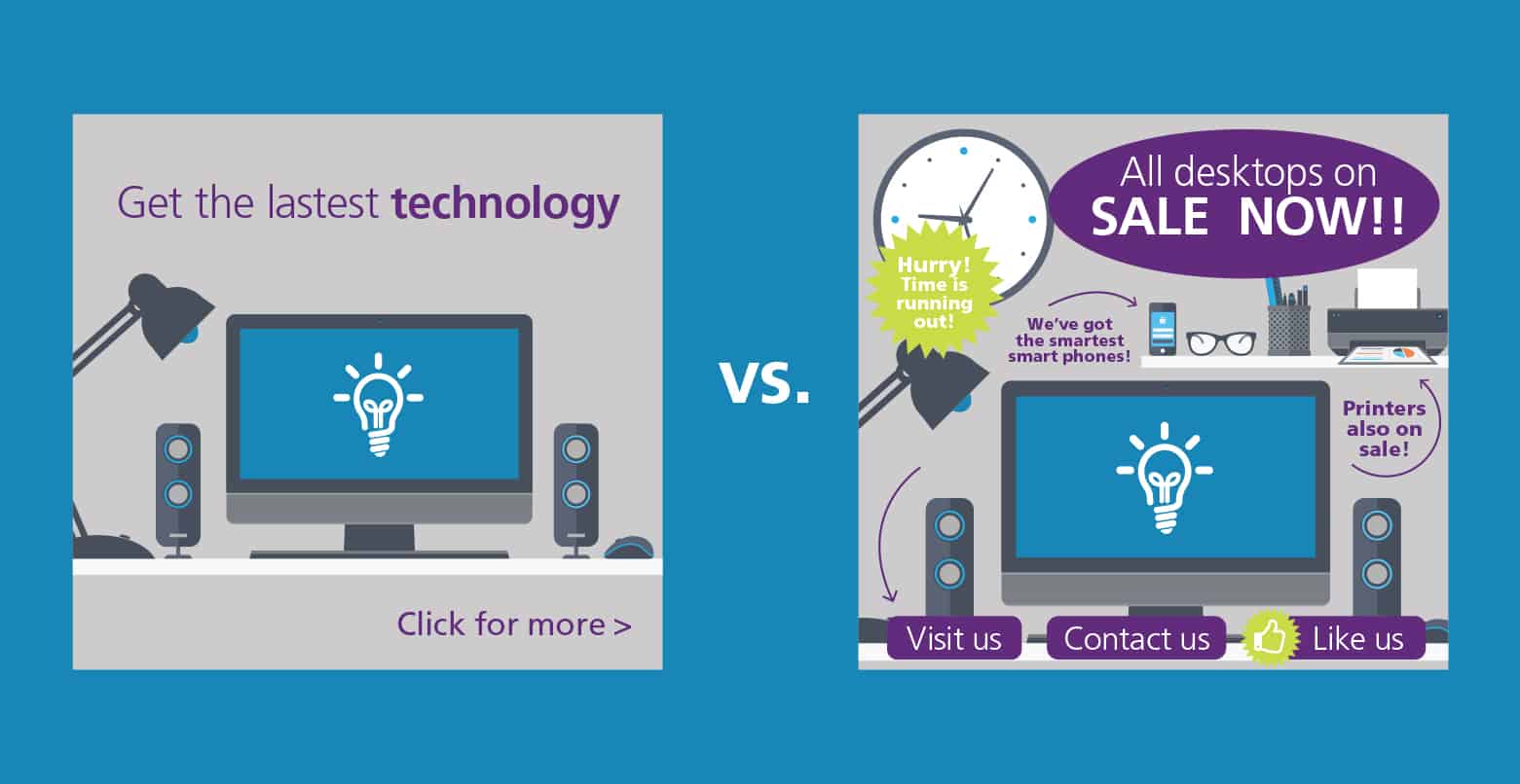 Figure 7: Masterful simplicity versus visual chaos[22]
Hiring a graphic designer: When graphic design tools aren’t enough
Marketers have loved the growth of low-cost graphic design tools, but graphic designers aren’t quite sold. The tools are, in part, driving a belief that design tactics are the same as design strategy. Check out these thoughts from a branding expert:[23]
“[Clients] have this wild perception that graphic design is essentially pretty pictures that almost anyone with competence in Photoshop can achieve. Have you ever been asked this question, ‘Wow, I love that design, what program did you use?’ Many clients have the perception that the program—not the talent behind the program—created their marketing.”
In addition, design often is treated as a commodity—a product that’s the same across markets, differentiated only by price.[24] The importance of the thought behind graphic design frequently comes in second to cost. But, if a logo can be created (inexpensively) in 20 minutes, more than likely, there wasn’t much thought put into it. And, this is bad news for the business behind the logo.[25] In many cases, you get what you pay for.
Therefore, certain situations call for a professional. A professional graphic designer can work faster than a novice, but there are other reasons to hire an artist:[26],[27]
- They’re impartial. They don’t have the emotional ties of a business owner, or even an employee. Designers can step back from a project and provide perspective.
- They follow rules. The rules of design, that is. They know the ins and outs of the psychology of color, web-ready versus print-ready graphics, how to build a visual hierarchy for information, copyright considerations, scalability and more. These details are part of their craft, and they’re often lost on non-designers. They ensure all marketing materials have a consistent look that represents your brand, because inconsistent artwork calls your legitimacy into question. Most important, designers translate complex ideas into clear, eloquent artwork.
- They are storytellers. They understand your values, mission and goals, and help tell the story of your brand visually. Little details add up to a bigger story. What’s more, thoughtful graphic designers don’t set up brands with flavor-of-the-week designs that quickly become outdated. The visuals they create are “well grounded and overflowing with purpose and meaning,” which means they’re a long-term investment that won’t need an overhaul anytime soon. In the end, graphic design tells your story, which differentiates you from the competition.
A graphic designer can help enliven your brand, drive new sales and retain customers.[28] By understanding each client’s unique goals, customers, tastes and more, a graphic designer creates visual marketing that’s bespoke.[29] Complete customization never is used to describe a commodity.
In the end, graphic design is a process, not just a set of tactics. Graphic design tools can help you develop visual marketing faster and (often) with a small price tag, but goals and strategy drive the most effective designs. Allow feedback from your internal team, customers and target audience to optimize graphic designs.[30]
Flex your artistic muscles with low-stakes graphic design projects such as social media images. Things with a longer shelf life—a logo or an annual report—likely would benefit from professional graphic design assistance. In any case, successful brand strategy comes from using graphic design tools with intent, making your visual marketing deeper than pretty pictures.
Page 1 of 2
