The bright red website button that tells you where to click. The shirt in a fashionable champagne pink that encourages you to buy. The branded promotional product in a trustworthy blue that tells you the company offering it is dependable.
Though we don’t always give them much thought, colours are everywhere. And everyday designers and brands are using them to tell us where to click, what to buy and who to trust.
Or, as the psychiatrist Carl Jung once stated, “colours are the mother tongue of the subconscious.”
In this Blue Paper, we’ll talk about all the ways colour affects us as well as how to choose the perfect brand and swag colours to tell your story. Read on to learn how to get your brand noticed and remembered.
Why is colour important?
Why is colour so important? Here are three reasons:
Colours draw attention
Colour can help improve memory. People who were shown the same picture in colour and in black and white remembered 5 to 10 percent more details when asked questions about the picture.
Colours appeal to emotions
Multiple studies confirm that purchase decisions are often made based on emotion instead of logic. In fact, there are many ways that colours tie to various feelings (more on that later).
Colour trends keep changing
Matching-colour system Pantone® created the Pantone Color Institute™, which studies and advises many industries on seasonal colour trends. These trends then spread to fashion, paint colours, and TV commercials.
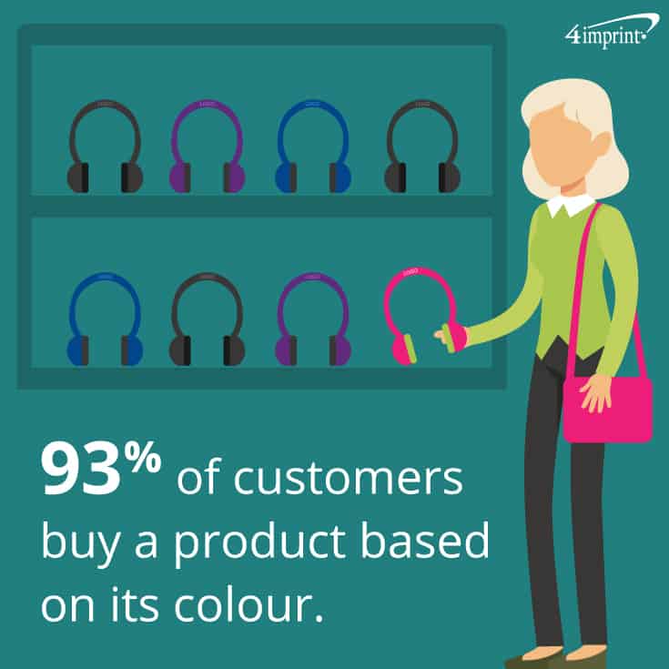
Colour’s importance can be summarized in a single statistic: 93 percent of customers buy a product based on its colour.
When colour talks
Much like listening to music or reading a good book, colour evokes emotion. Colour psychology—the study of the way hues determine human behaviour—offers some insight into the way various colours affect people, particularly when it comes to branding.
Fast-food restaurant logos offer well-known examples of colour use. The most popular fast food chain uses red and yellow, for example. These colours represent excitement and happiness, respectively—the perfect combination to draw someone in for a snack or meal.
Oberlo offers a simple list of emotions that colours evoke in branding:
- Red: Excitement
- Orange: Friendliness
- Yellow: Optimism
- Green: Peace
- Blue: Dependability
- Purple: Creativity
- Grey: Calmness
While these colours and emotions are helpful when you’re creating your brand or logo, sometimes it’s helpful to look beyond the most common meanings of colours.
The culture of colour
While colours often relay specific messages, it’s important to note the language of colours isn’t universal.
For example, in Western cultures, red generally indicates excitement, passion and love. But if you take a look around the globe, you’ll find a different story.
- In China, it symbolizes good luck, joy and prosperity.
- In India, it indicates purity and spirituality.
- Many countries in Africa associate it with death.
And of course, it’s always wise to consider other common cultural meanings for specific colours. While green is a calming colour we associate with nature, it’s also the colour many people associate with money.
Keeping brand colour consistency
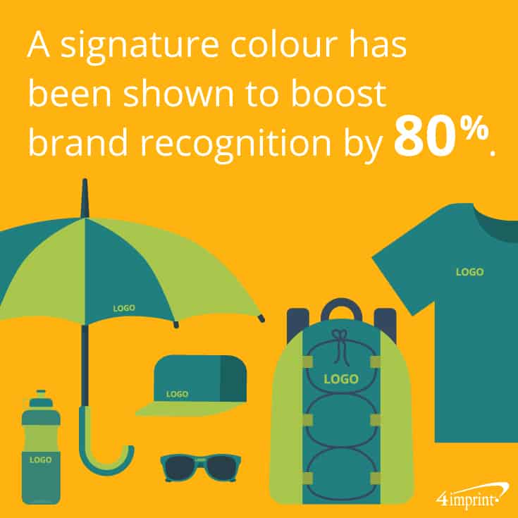
The human brain prefers recognizable brands. And colour is a significant factor in that recognition. In fact, it’s so important that “UPS® brown” and “Barbie® pink” are trademarked. Plus, a signature colour has been shown to boost brand recognition by 80 percent.
If you’re designing your first logo or going through a rebrand, choosing the proper brand colour can help send customers down the proper psychological path.
When it comes to telling your brand story, start with the traits you want to emphasize and select a brand colour or colours that represent those traits. This will help you relay the message you want your customers to receive.
Be sure to consider:
- Target market: Rather than selecting a colour based on a feeling, decide on the feeling you’re trying to achieve.
- Appropriateness: With your target market and the feeling you want to convey in mind, select an appropriate shade. Blue may indicate dependability but choosing a shade that’s too light might imply that you’re selling to young children.
- Consistency: While rebranding is sometimes appropriate, putting your brand through frequent changes can be confusing to customers—and make it more difficult for customers to locate you at a glance.
Of course, while tone and consistency are important, you also want to be noticed. If your industry has a lot of yellow in their branding, choosing something different—like a light orange—can help your brand stand out.
Hues that complement your brand
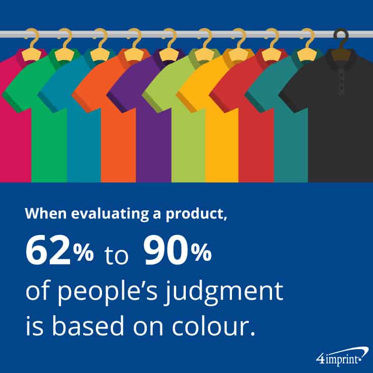
When choosing promotional or other products for your company, it’s just as crucial that swag colour complements—rather than clashes—with your brand colours, especially your logo. After all, we judge products by their colour, according to an Institute for Color Research study. In fact, 62 to 90 percent of a product’s evaluation is based on colour.
Selecting the perfect product to show off your brand involves a variety of factors: getting the proper colour match on your product, choosing a perfect contrast colour, and thinking about the theme of an event you’re planning to attend, just to name a few.
Consider the products you want to carry your colour
Choosing the perfect item to show off your companyfrequently involves starting with brand colours and working from there.
Before you start selecting branded promotional products, it’s important to determine how you want to present your company colours and logo. Do you want your logo to use your brand colours, while your promotional products provide contrast? Or do you want your product to feature your brand colours, while your logo is presented in black or white? Both options have positives and negatives.
“Consistency can be very important to a customer,” said 4imprint Training Specialist Rachel Tease. “They may want their brand universally known not only by the image but by the colours they chose for their logo. However, it also means that the brand will be getting a smaller, less visible presentation.”
Alternately, having the product carry your colour can make for excellent brand visibility, but it can also limit the promotional products you’re able to use if a particular colour isn’t available.
Contrast your logo with your products
Tease offered some advice for finding the perfect contrast between logo and swag colours. “Dark logos can’t go on dark garments, just like light logos can’t go on light garments. You wouldn’t be able to read the logo,” Tease said.
If you’re looking to have your promotional product show off the colours of your brand, Tease suggests that using an all-white or all-black logo to contrast with your colour scheme.
Also, using a colour calculator can help you find the perfect contrasting colour to make your brand stand out.
Try before you buy
Before you commit to buying hundreds of pens, shirts or other promotional products, take a look at a mockup and ask for a sample, if possible. The product may look right on your computer screen, but may not be the right fit in reality.
Frank Barrett can attest to that experience. A few weeks before launching their new Canadian subsidiary of Joe Walsh Tours, a tour group organizer in Ireland, Barrett, President and CEO, decided to purchase matching shirts. The dress shirts and a Jerzees® Spotshield Jersey Knit Shirt helped them emphasize their brand. The primary reason for that shirt choice? The colour.
“We wanted a branding image consistent with Joe Walsh Tours,” Barrett said. “If you look at their website, they use a colour scheme of dark blue, pale blue, orange and white. We thought the light blue was the best choice for our shirts.”
That’s when Barrett learned about the importance of samples. After selecting a shirt that looked perfect on his computer screen, he realized upon seeing the sample that the shirt didn’t look quite right. “The original sample shirt had a different tone,’” he said. “I said, ‘This is close, but it’s clearly not the same.’”
Luckily, he was able to make a trade—and the new shirt was a perfect match.
The outfits accomplished precisely what Barrett had hoped for. “We all had dark blue pants and Joe Walsh shirts and it helped us look really professional,” he said. “And now we’ve got a branding image that’s consistent with the Ireland group. We’re part of something important here.”
Think about your theme
While brand consistency is key, sometimes you’ll want to offer specialized promo products for an event or promotion.
In those instances, Tease suggests that you tweak your brand colours. For example, if your brand colour is a royal blue, but you’re throwing an island-theme event, consider a lighter shade of your brand blue to stay consistent.
Branded promotional products tell your story
Colours aren’t just all around the world—they make the world go ‘round. Selecting the right swag colours to complement your brand helps tell your story. And most important of all, it helps customers remember you.